OVO Wroclaw Centre: a milestone in urban architecture
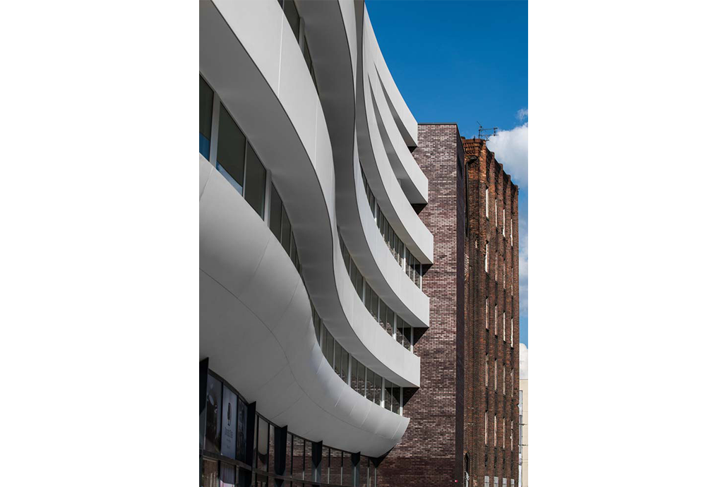
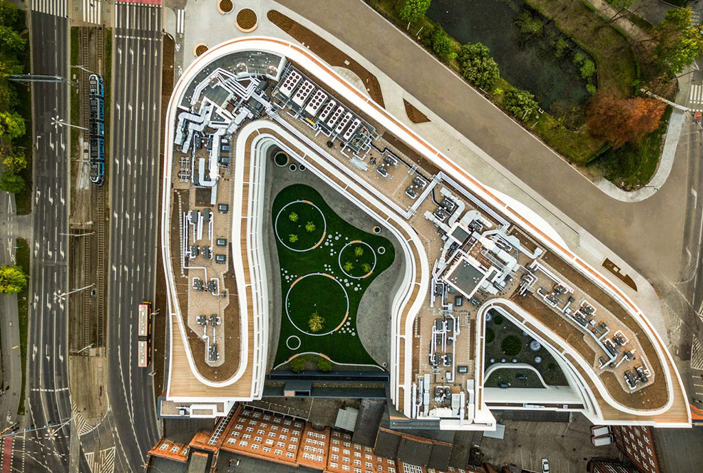
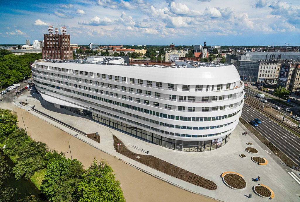
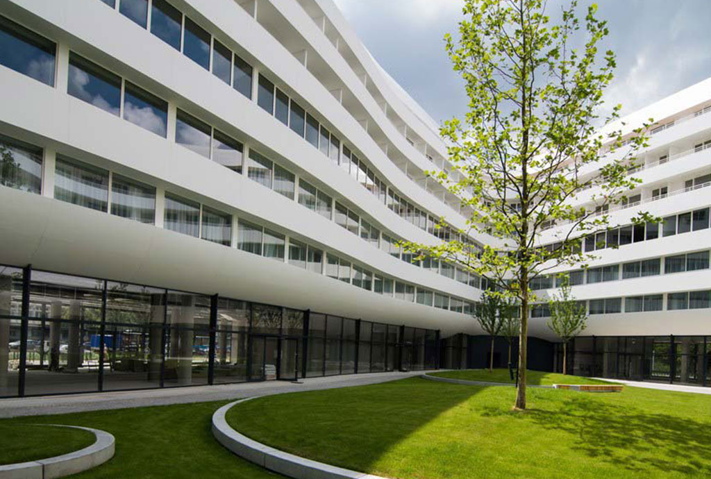
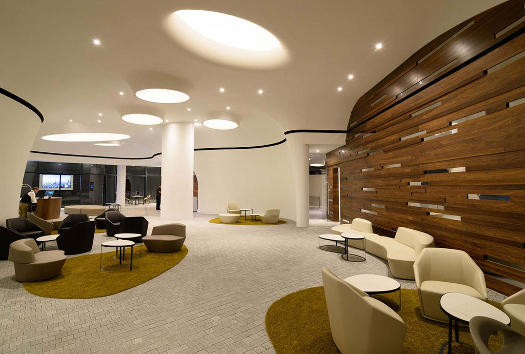
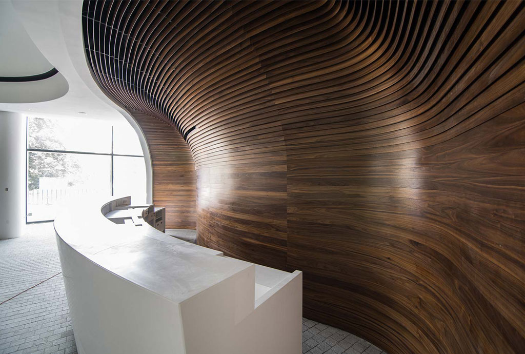
The ultra-modern OVO Wroclaw complex comprises 50,000 square metres in Wroclaw, Poland’s fifth largest city. Designed by Gottesman-Szmelcman Architecture, with JSK Architekci as executive architects, this statement-making project is located near the historical market square and features an inspiring rounded façade made with DuPont™ Corian® high-tech surface in white colour. An astonishing 6,000 square metres of sophisticated Corian® wraps around corporate offices, 180 luxury residences and a five-star DoubleTree by Hilton hotel with 189 rooms and suites and offers a majestic view for visitors to its sprawling inner courtyard.
This sleek white structure takes its place next to the classical Brick Expressionism post office and is now a part of Wroclaw’s evolving urban landscape. Wroclaw, a business city set on the banks of the Odra River, offers a variety of architecture and is the ideal setting for the OVO Wroclaw to make a significant statement. Gottesman-Szmelcman Architecture’s concept focused on layering the building in such a way that it reflects the complexity and richness of urban life.
Architect Asaf Gottesman explains the history behind this extraordinary structure. “OVO Wroclaw began 10 years ago, in 2006. It is a result of an international competition and although we began working on the site prior to the 2008 financial crisis we were forced to stop the works because the banks were unable to fulfil their financial commitments. In order to move forward, we had to restart the project in 2012.” Adds Architect Gottesman: “As an architectural practice our work is always site specific. We pay particular attention to the cultural and urban context. As a practice, we are also always involved in the development of the programme and we consider the programme as a critical component of the architectural process. As a practice, we tend to be concept driven rather than pre-determined by stylistic considerations. Finally, like most architects and artists, we tend to create problems and a part of what defines us is how we choose to resolve the technical challenges that are a part of the creative process. So when we first came to Wroclaw, what struck us was the incredible diversity and plurality that is inherent in the architecture. Contrast is celebrated here and it is the inherent openness and curiosity of Wroclaw that so attracted us.”
The plot where the OVO Wroclaw stands wasn’t easy to design. There is an existing post office made of bricks on one side and major thoroughfares on the other two, which means a major car traffic and significant emissions. Thanks to the non-porous and easy to clean surface of DuPont™ Corian®, the façade will be pristine and beautiful over the long haul. Furthermore, if anything happens to the curves on the façade, it can be mended on site without having to dismantle it.
Asaf Gottesman describes an idea behind the project. “Here is a simplification of the process by which we developed our conceptual guidelines. Inspired by the pluralism and diversity of Wroclaw, we chose to underline a dialogue that celebrates contrast rather than mirroring:
- OPEN-CLOSE: If the post office is a typical public building that is closed and underlines boundaries, we chose to envision an open building, one that is a part of the public space.
- OPEN-GREEN: we retained the boundaries of the urban block but we created an internal public garden.
- LIGHT-DARK: While the post office is dominated by the deep richness and detailing of red brick we opted to go with white Corian® and to underline the play of light and shade. An additional reason for choosing Corian® was our desire to align the way we work with 3D modelling and its translation into the built form. Corian® enabled us to retain the spirit of the design, its minimal lines and perfectly curved surfaces.
- SOFT-HARD EDGE: If the post office is a solid mass defined by hard edges, we sought to create a softer and more ambiguous contour to our building.
- DYNAMIC-STATIC: If the post office is the manifestation of a classical world view of repetitive windows and a static façade, we sought to introduce motion and dynamism rather than classical repetition. The result, I believe, is typically Wroclavian; a manifestation of plurality, contrast, openness and dialogue.”
The amorphous design that was envisioned required alternative building techniques in order to be properly realized. After considering various options, Gottesman-Szmelcman Architecture chose to clad OVO Wroclaw with panels made with DuPont™ Corian® high-tech surfacing material.
Other Projects
Calacatta Greige Kitchen
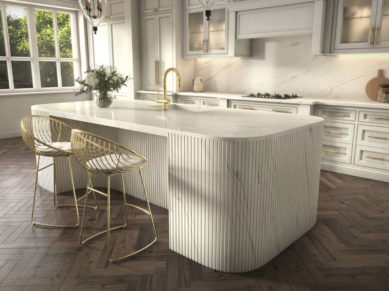
At the heart of this kitchen design is a Corian® Calacatta Greige benchtop and splashback combination. The benchtop stretches across the kitchen with a clean, smooth finish that highlights the beauty of its creamy base and delicate veining. This continuous surface flows effortlessly up the wall to form the splashback, creating a sleek, cohesive look. […]
T2 Heinemann Project
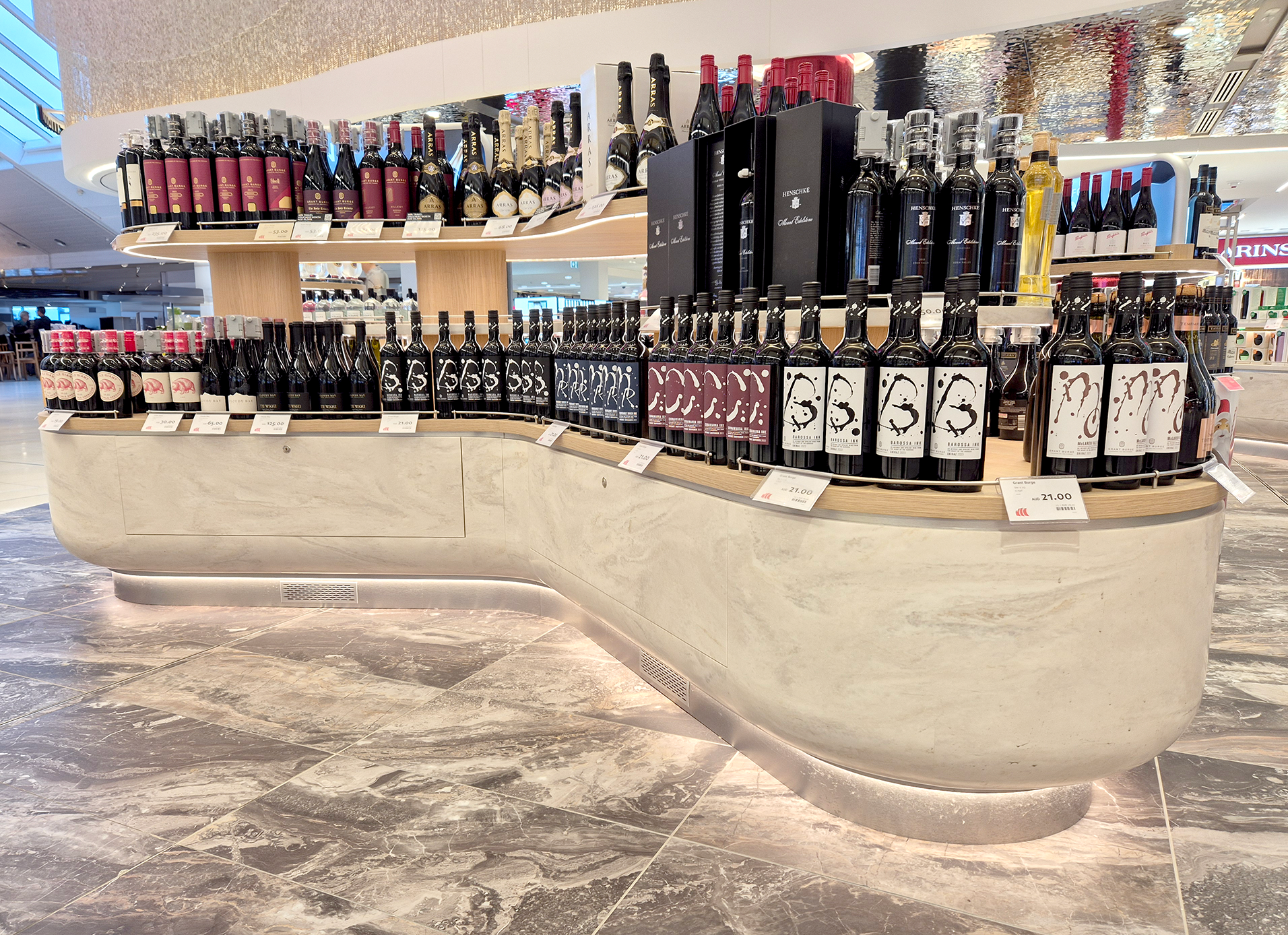
Heinemann Oceania transformed their retail space within Sydney Airport’s T2 and T3 domestic terminals, introducing a department store experience for domestic travellers—a first for Australian travel retail. This project aimed to blend high-end shopping with the bustling airport environment, creating an elegant and functional space for travellers. For Terminal 2, the design was inspired by […]
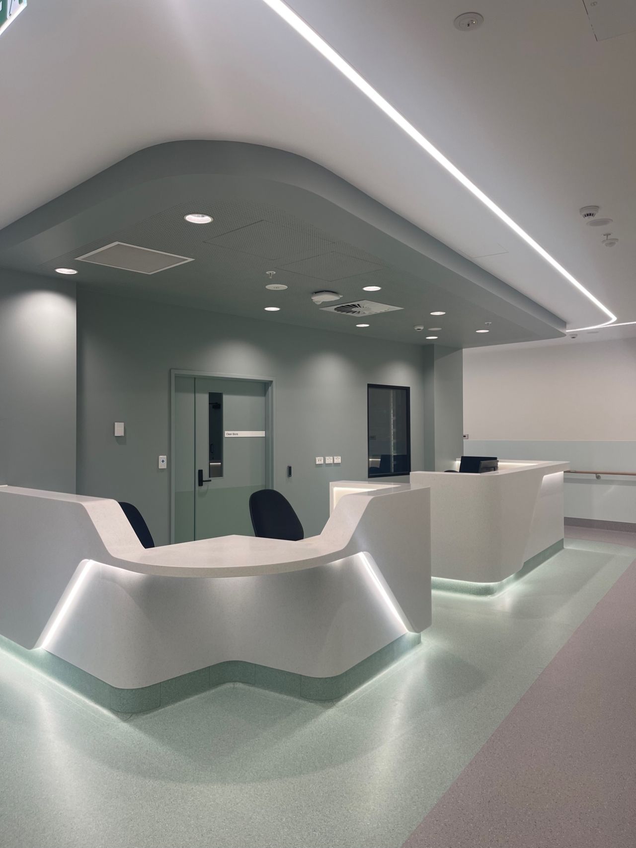
Alfred Lane House Infectious Diseases
The Alfred Lane House Infectious Diseases Project at the Alfred Hospital has transformed a once under-utilised 1960s brick building into a modern, inclusive space that is designed to facilitate the recovery and rehabilitation of HIV-positive patients. This newly developed space supports an innovative model of care that allows patients with compromised immune systems, who often […]
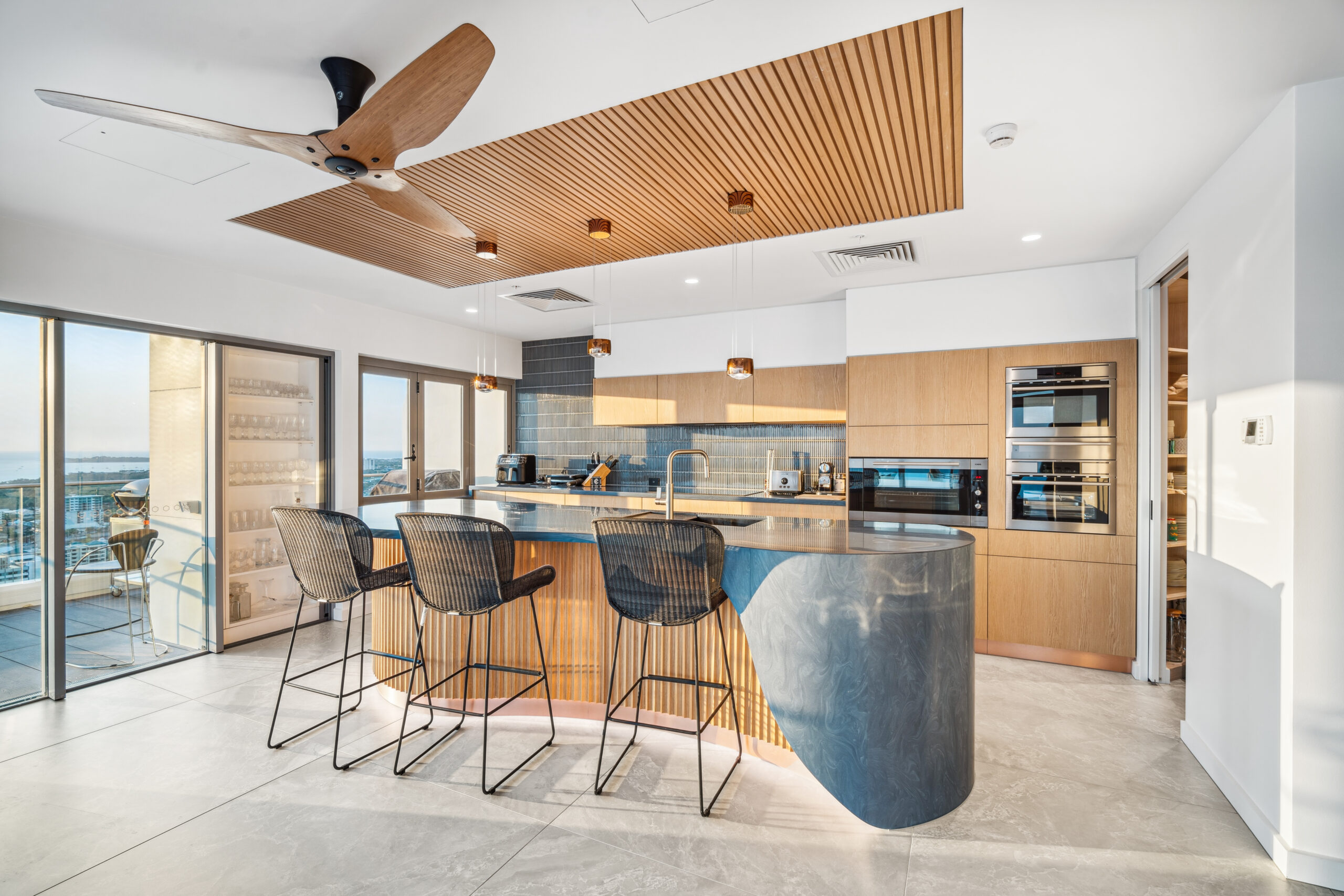
Mantra Apartments Darwin NT
The refit of the penthouse apartment on Level 28 of Mantra Pandanas in Darwin, NT, presented an exciting opportunity to elevate an already luxurious space to new heights. The project encompassed a complete overhaul of the living zone, including new flooring, ceiling finishes, joinery, lighting, fans, and wall treatments. The goal was to transform this […]
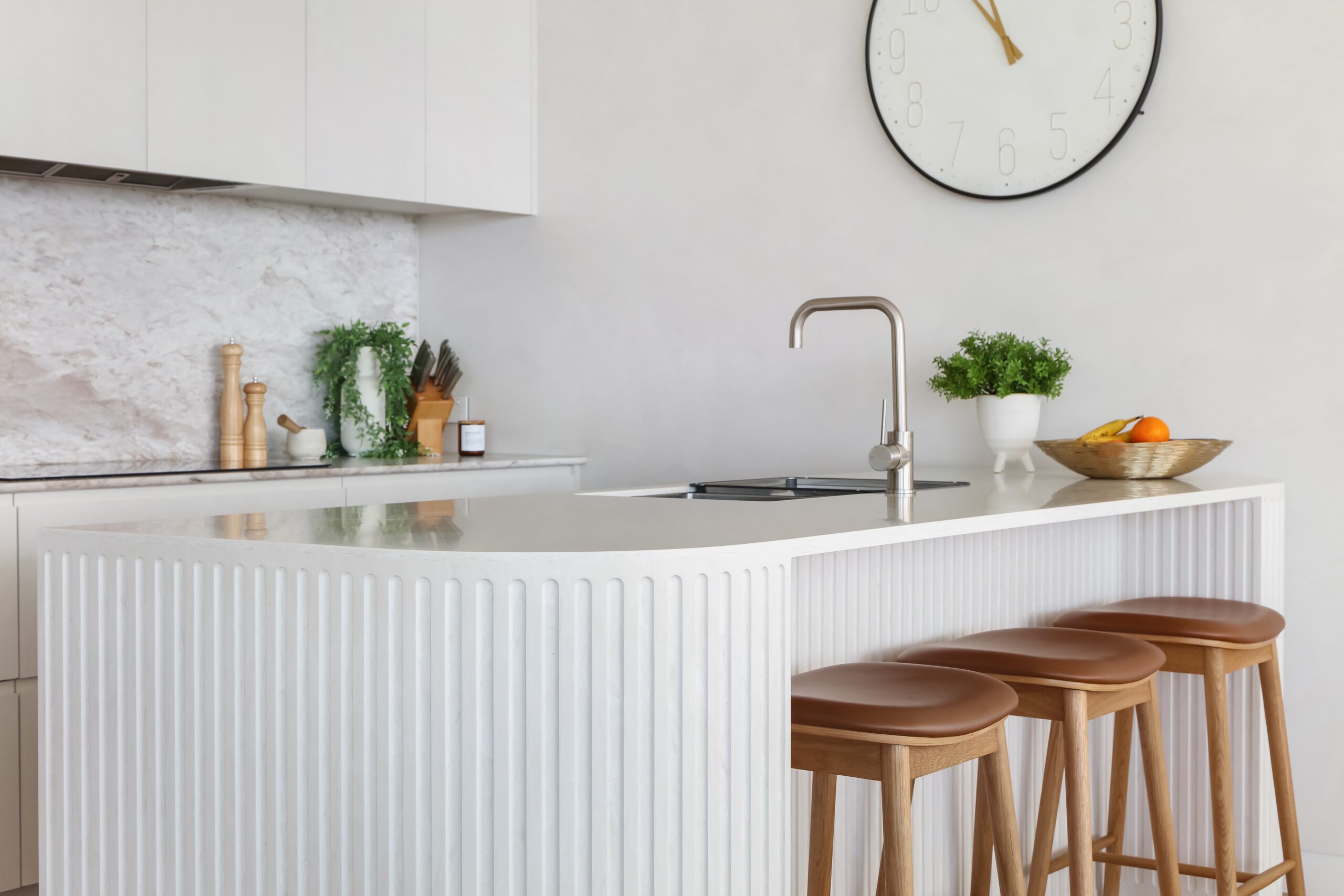
Audrey Residence
The design of the Audrey Residence masterfully balances the principles of architecture with the beauty of nature. Situated on a sand dune overlooking Bate Bay, Audrey Residence is a stunning addition to Cronulla’s iconic oceanfront. It offers luxurious, relaxed living and sets a new benchmark in high-end beachside residences with generous floor plans and exquisite […]

Motor Yacht More
Boat Style embarked on a comprehensive interior and exterior refit of a 44-metre Benetti Vision superyacht. Central to the redesign was a transformation of the Main Saloon, where a large entertainment cabinet and timber dining table were removed to create a more open and functional space. In their place, a ceiling lift widescreen television and […]
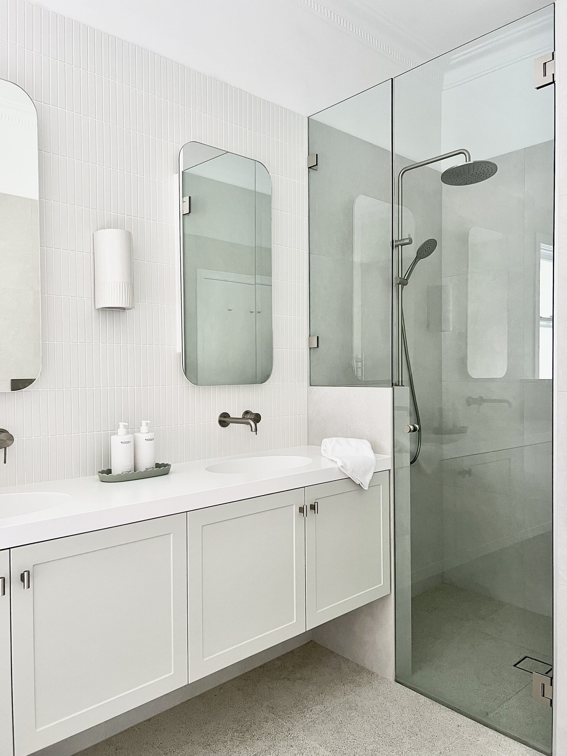
Willoughby Bathroom
Tranquil Bathroom Renovation: A Serene Escape This Willoughby home recently underwent a stunning transformation in both the main bathroom and ensuite, creating tranquil retreats perfect for relaxation and rejuvenation. The design features soothing shades of grey, blending seamlessly with neutral tones to evoke a peaceful and calming atmosphere. One bathroom features a minimalist single basin, […]
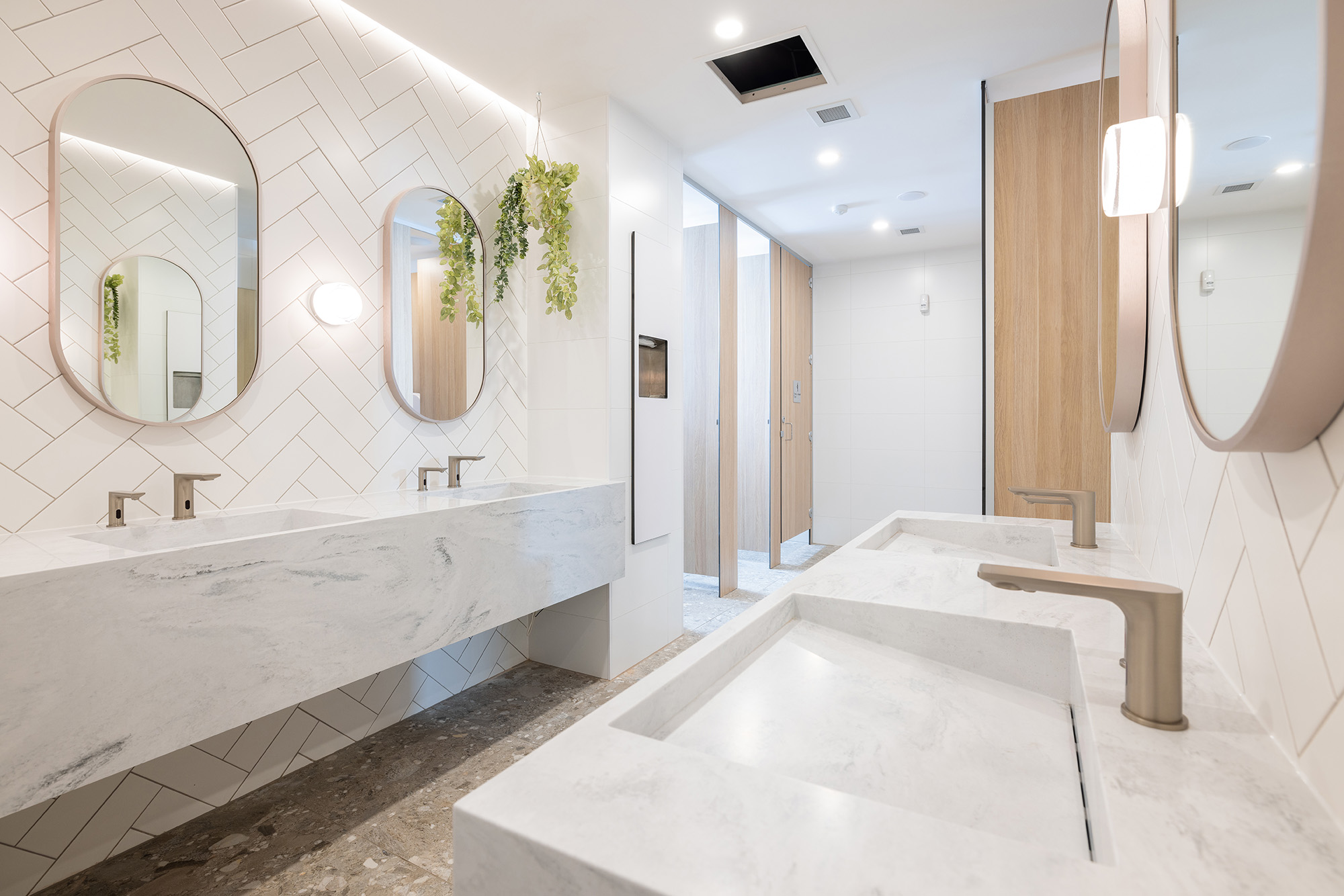
Souths Merewether
Souths Merewether, a prominent club located just minutes from Newcastle’s CBD, has undergone significant renovations, transforming its interior spaces to reflect a more contemporary and inviting atmosphere. The refurbishment brings together the latest in design and functionality, offering patrons a premium experience in comfort and aesthetics. One of the most impressive updates can be found […]
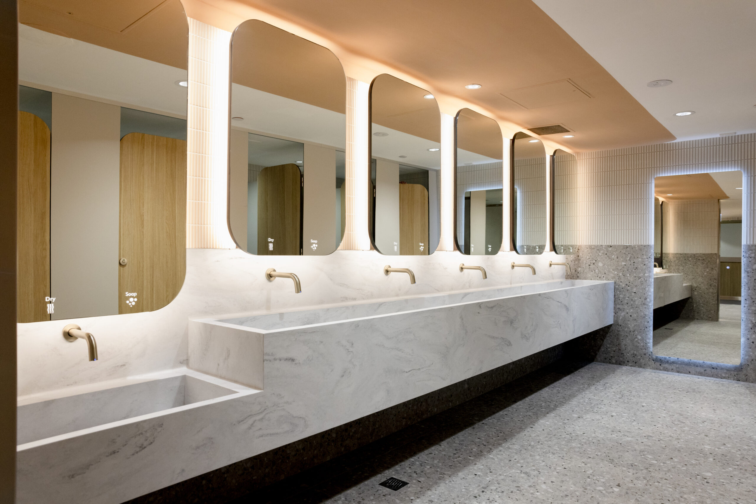
Vicinity Centre Cranbourne Park
Vicinity Centre Cranbourne Park, a single-level regional shopping centre located approximately 51 km southeast of Melbourne’s CBD, has recently upgraded its bathroom facilities. With 47% of visitors identified as families with children, as reported by Vicinity Data, Research & Insights, the new amenities reflect a thoughtful consideration of these demographics. A key feature of the […]
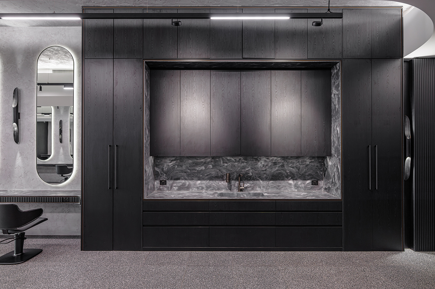
EscapadeHFB
A new state-of-the-art hair and beauty salon has been introduced in Granville, NSW, featuring a bold, modern design that harmonises light, function, and texture. The salon embraces black as the new white, creating a sophisticated and moody atmosphere that exudes luxury and exclusivity. The project involved transforming a challenging 40-meter-long property, aiming to create a […]
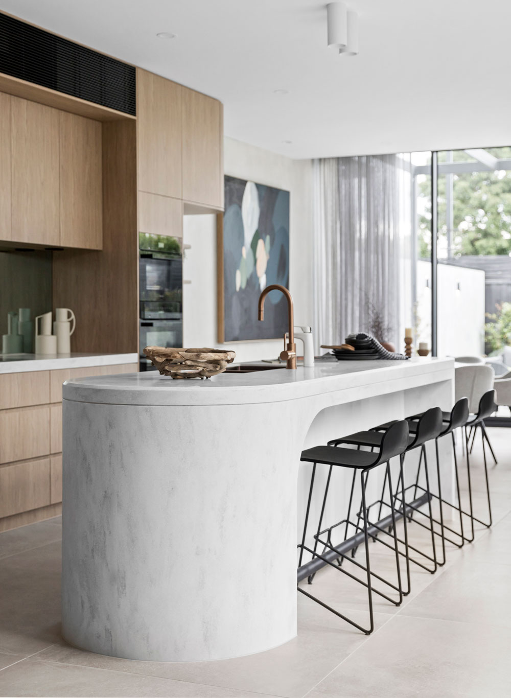
Brighton East Home
Located in Brighton East, this stunning open living home is a beacon of modern design. With ample natural light pouring through large windows and expansive glass sliding doors that open directly to the backyard, the interior spaces are bathed in a warm, inviting glow. The focal point of this sophisticated home is the remarkable curved […]
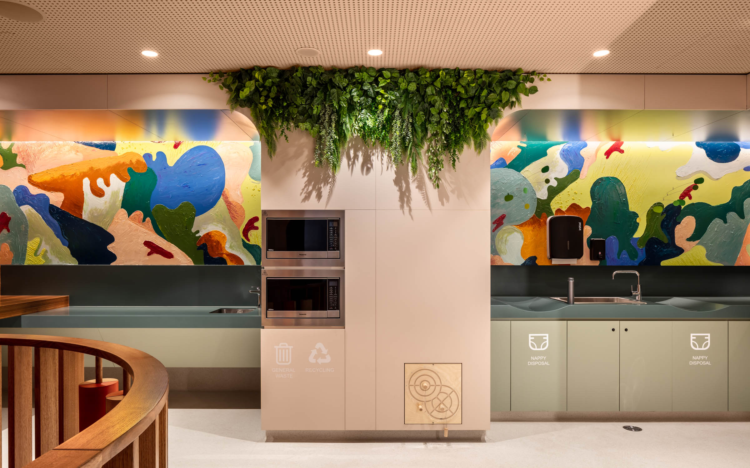
Canberra Centre Parents Room
Designed as part of a new hospitality precinct, the Canberra Centre Parents Room is a highly functional space that caters to the diverse needs of parents and their children. The team at Mather Architecture have created an immersive, modern, and playful experience that focuses on inclusivity and neurodiversity. The Parent Room design adopts an inclusive […]
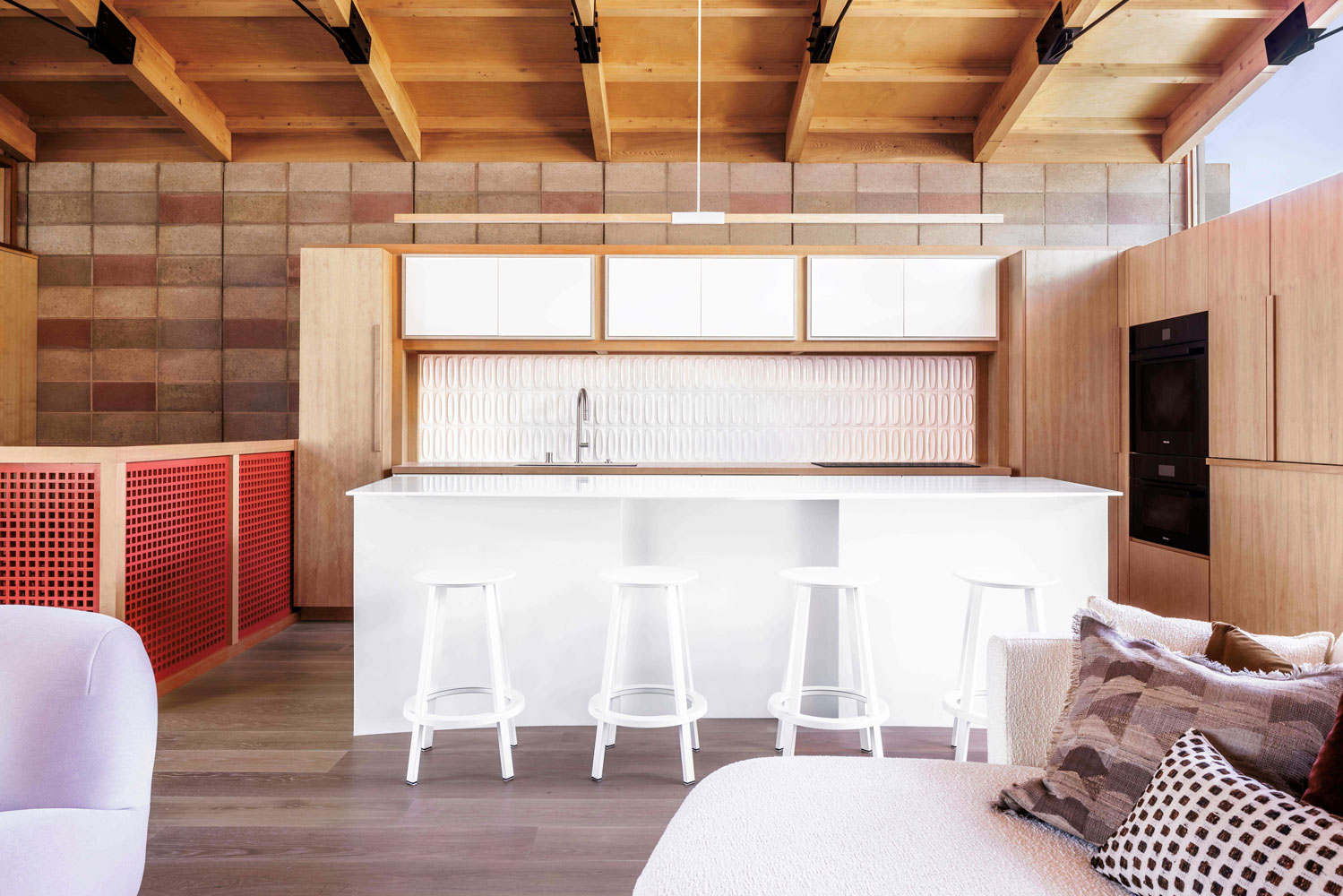
Potrero Hill Residence
The Potrero Hill residence, located in San Francisco is a renovation project that aims to rejuvenate a 1991 artist’s studio and dark room into a 2-bedroom residence that artfully marries elements of Japanese design with local and international influences. Designer, Brooke Aitken centered the project around an existing cherry tree, leveraging its natural beauty to […]
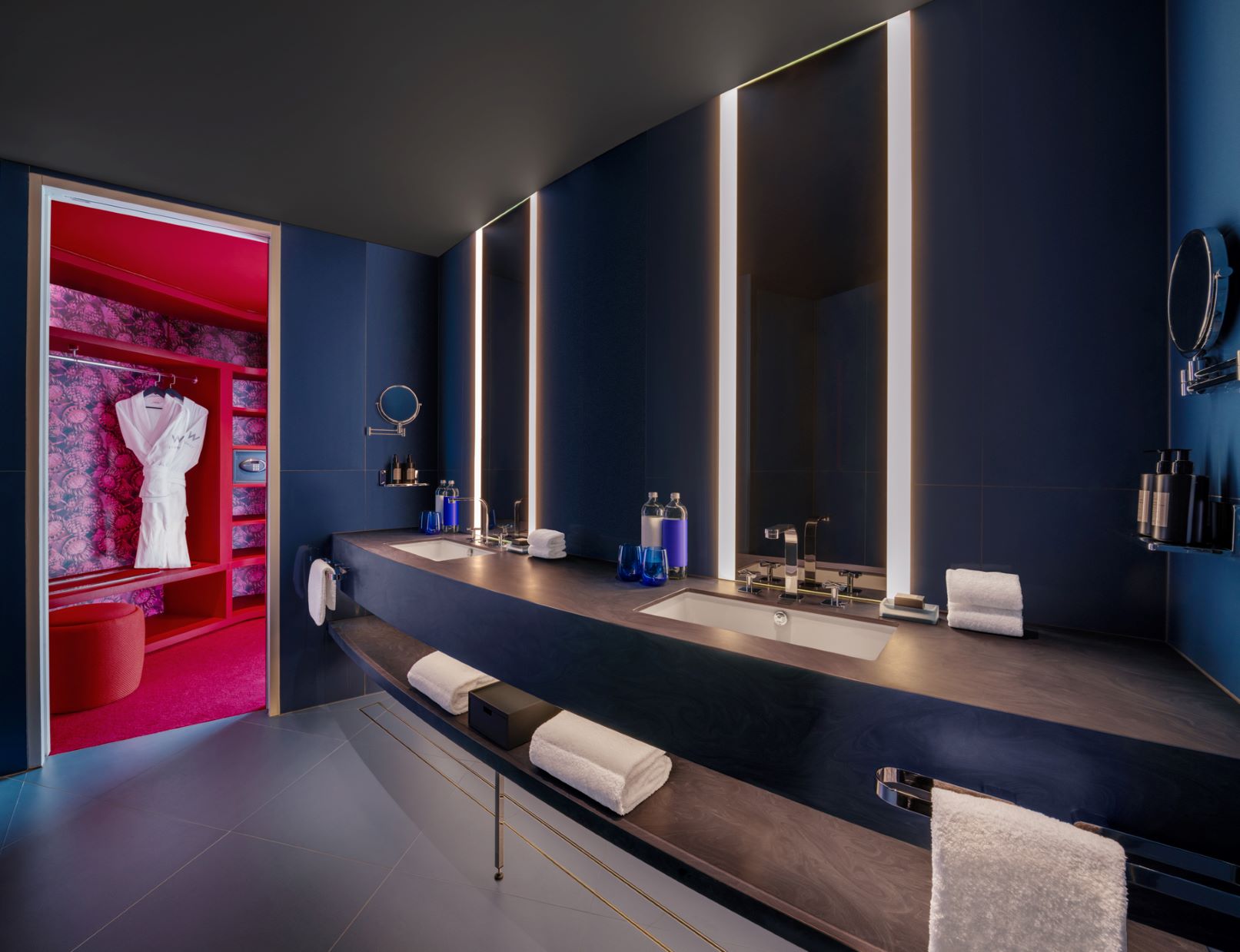
W Sydney Hotel
Nestled in the vibrant heart of Sydney’s Darling Harbour, the W Sydney Hotel stands as a modern marvel, redefining the essence of luxury and hospitality in one of Australia’s most beloved cities. This expansive facility provides a range of immersive attractions and amenities, catering not only to discerning travelers but also serving as a favoured […]

Ahead of the Curve – La Casa Curvilínea
La Casa Curvilínea is truly ahead of the curve with its minimal, modern interpretation of Mediterranean design by the visionary duo, Tyson and Teegan Doherty of Doherty Building Group. This beautiful four-bedroom family home is a symphony of gentle curves, warm hues, and innovative materials. At the heart of this serene abode lies its kitchen […]
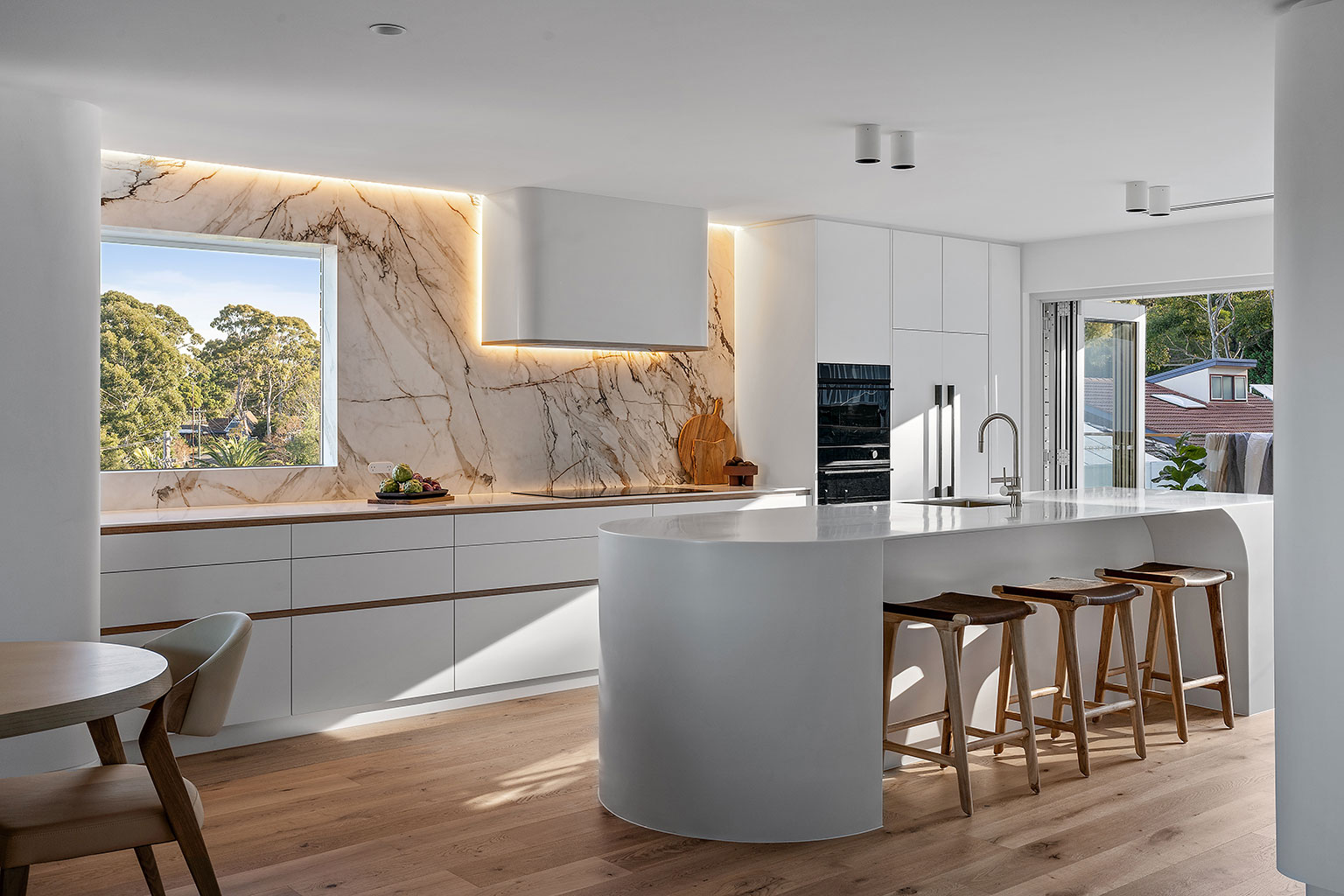
The Avenue
When it comes to home renovations, it’s not just about the visual appeal but also about functionality, durability, and most importantly, the lifestyle it supports. Situated on the south coast, “The Avenue” is a prime example of how a full home renovation can be seamlessly blended with design and practicality. Taking inspiration from its coastal […]
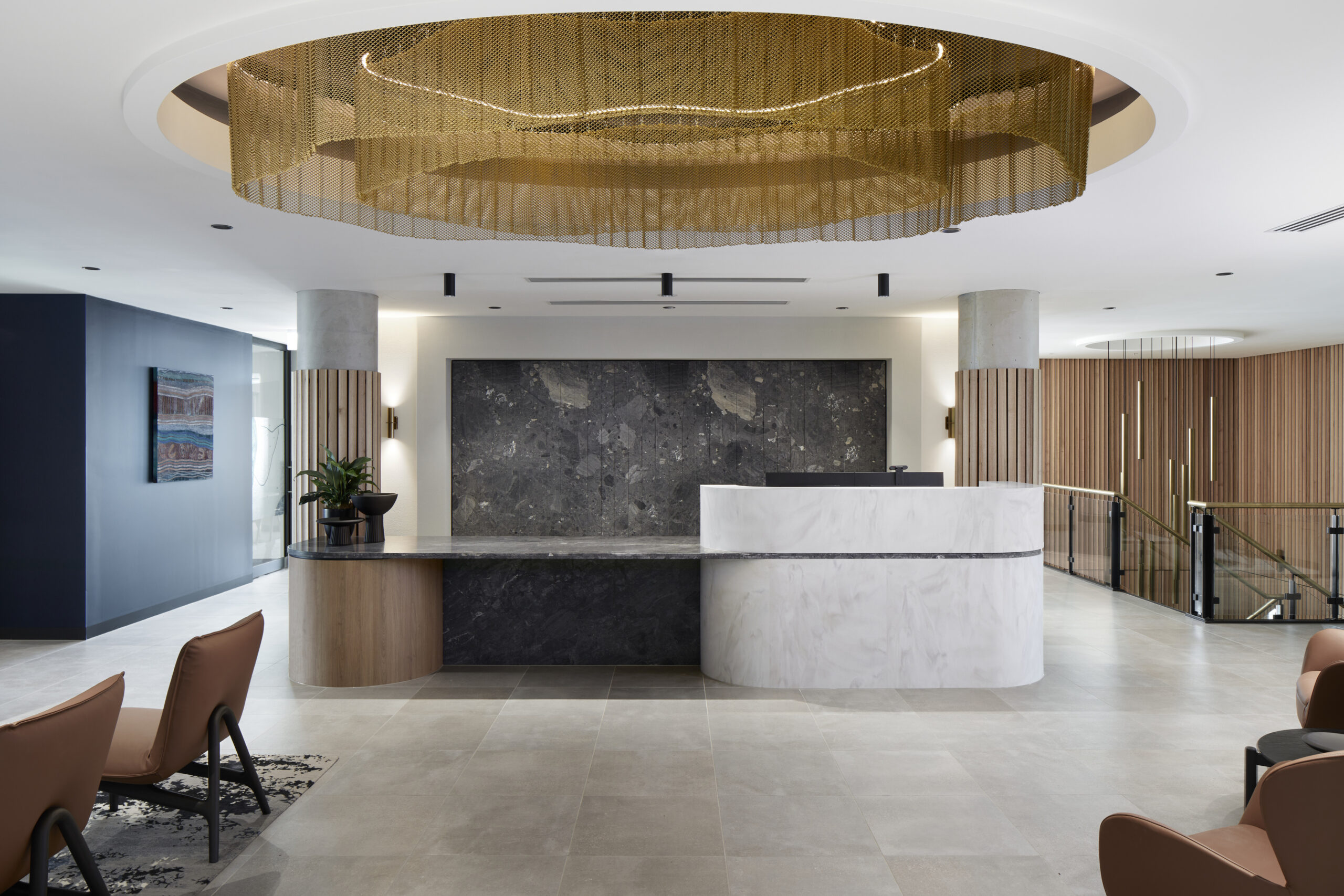
727 HQ Office
The 727 HQ Fitout is a bespoke two-level office located within Newcastle’s newest commercial high-rise, offering sweeping views from Newcastle Harbour to the Hunter Hinterland. Designed to harmonise with its natural surroundings, the fitout accommodates over 200 staff in a functional workspace that reflects the essence of land and sea. Corian® was selected as the […]
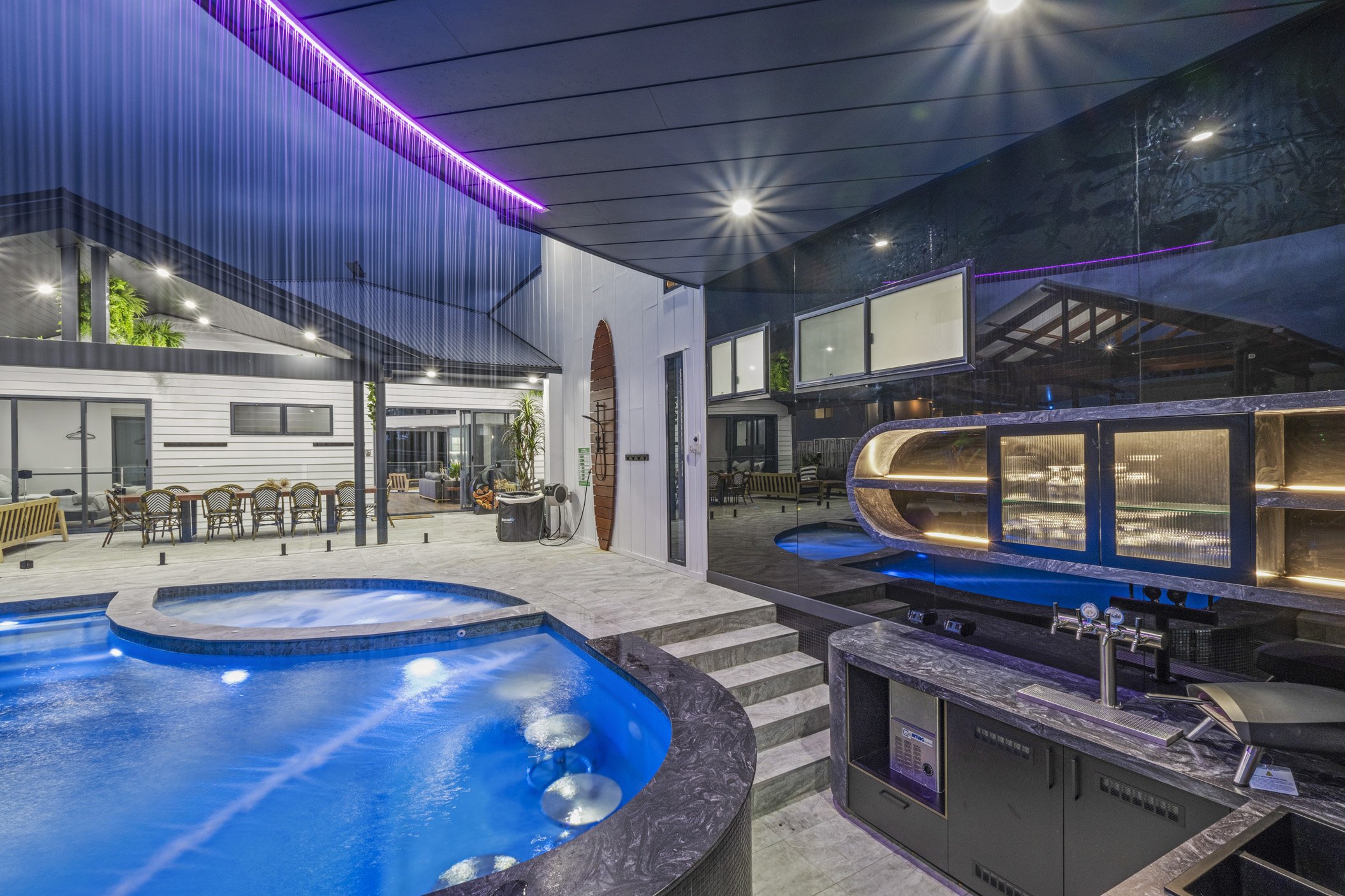
Moogerah Lake House
The Moogerah Lake House is an American-style lake house, designed exclusively for holiday rentals and entertaining. Situated in a picturesque location, the property exudes charm and elegance, making it a perfect getaway destination. Living Dream Kitchens, selected Corian® in the colours Witch Hazel and Cosmos Prima for various applications throughout the house, showcasing the exceptional […]
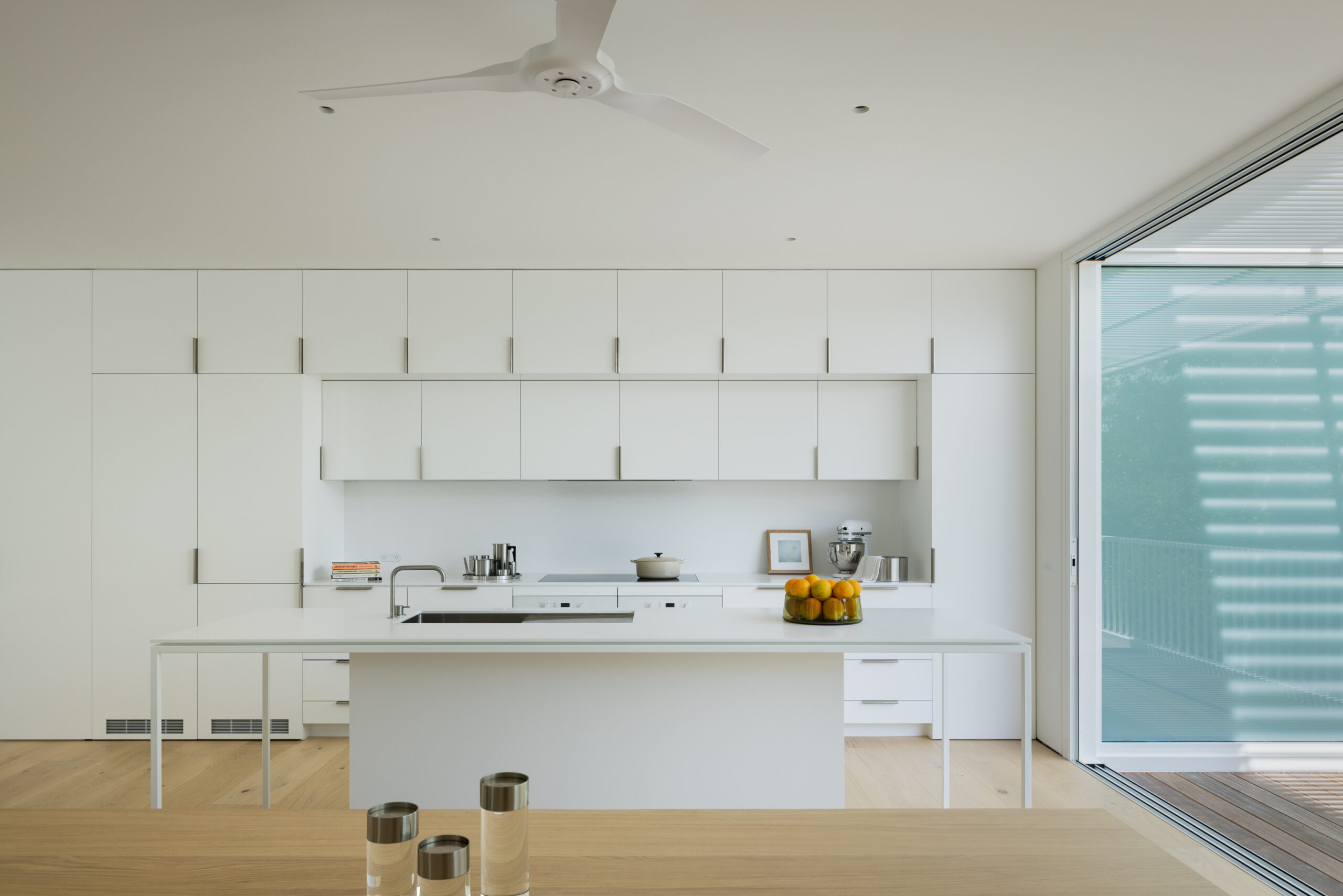
Watsons Bay House
This residence, nestled in the Watsons Bay Heritage Conservation Area, embodies a harmonious blend of traditional aesthetics and contemporary design principles. Its structure, a three-level house, pays homage to the architectural heritage of the area’s original fishing village cottages. Yet, it diverges into modernity with its innovative use of space, materials, and integration with its […]
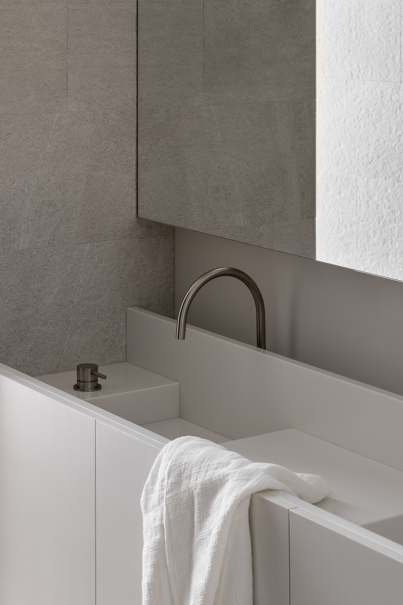
Armadale House
Armadale House, by architect and designer Emma Selzer of Selzer Design Studio, is a stunning example of how thoughtful modern design can seamlessly blend with Edwardian architectural roots to create a family home that’s both functional and serene. This project emphasises the importance of light, materiality, and historical integrity in contemporary restoration. Emma has approached the design […]
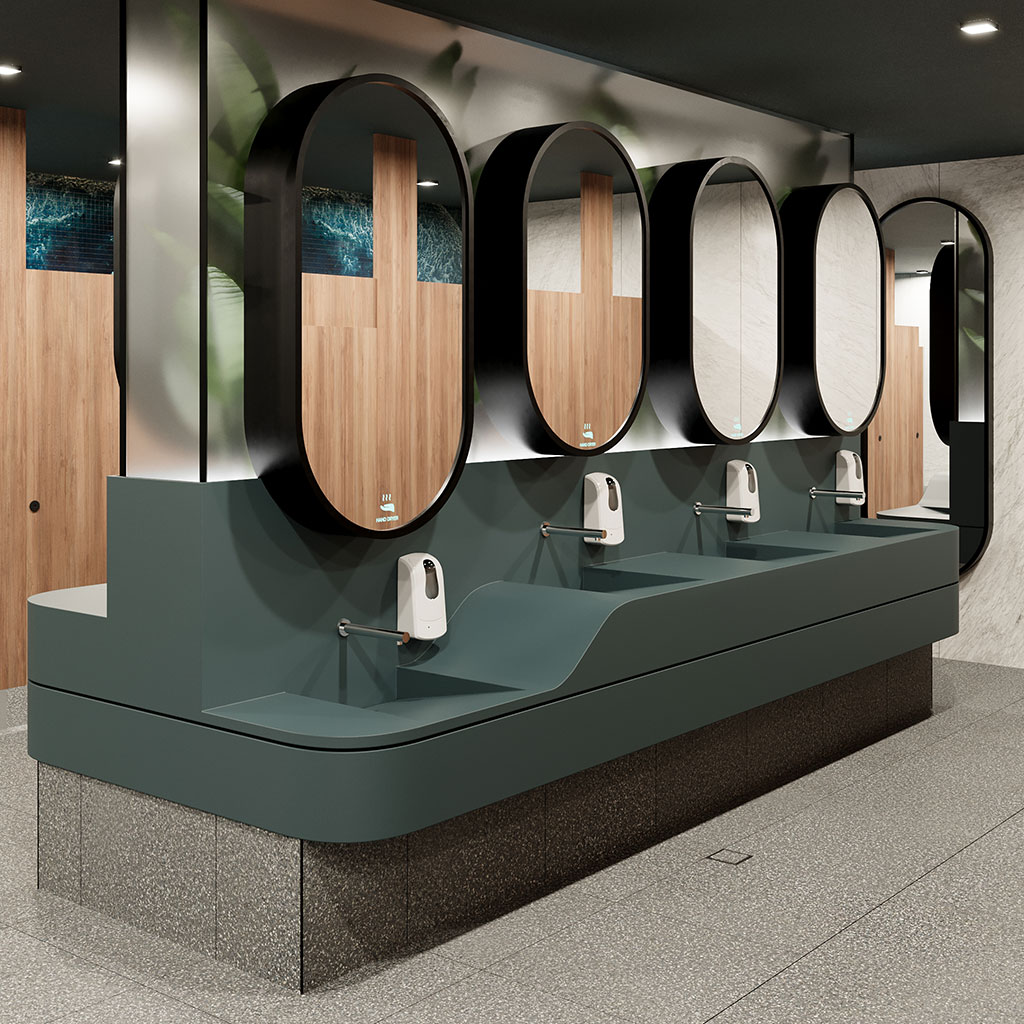
Robina Town Centre Amenities
The i2C Interiors Team was engaged by QIC to re-imagine the amenities with a particular focus on the parent’s room at Robina Town Centre. Understanding the importance of amenities as a key customer touch point, QIC’s brief to i2C was to create a design that was better representative of the Robina Brand and more focused […]

Central Park Tower, Perth
The new Central Park Cafe, Hemingway, was designed in conjunction with the Central Park Lobby upgrade. The curved monolithic forms of the main lobby extended to the new cafe counter, with a large boulder-esque sculpted appearance, gently resting in place. The design team designed a cafe counter to look like a large boulder and were […]


