


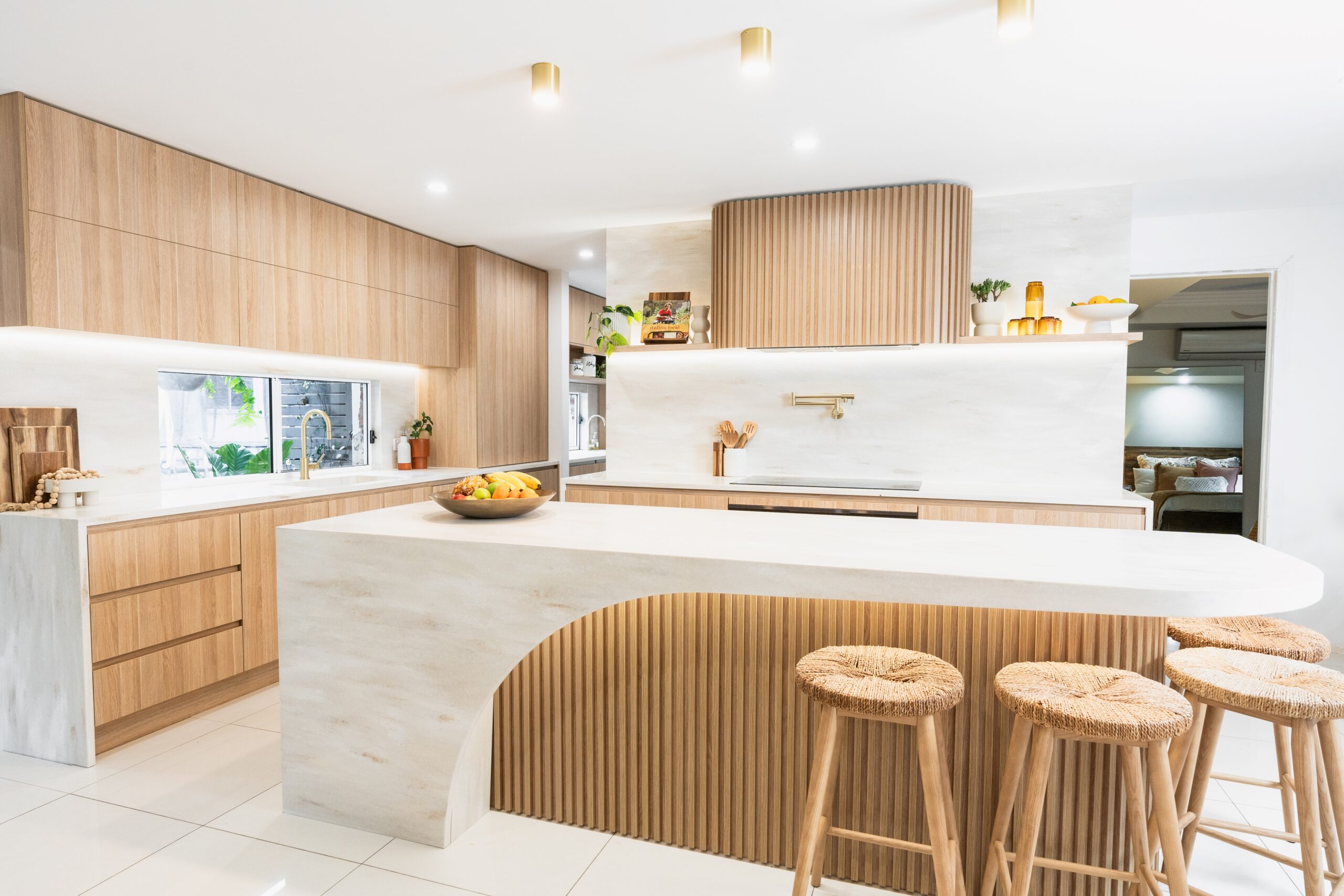
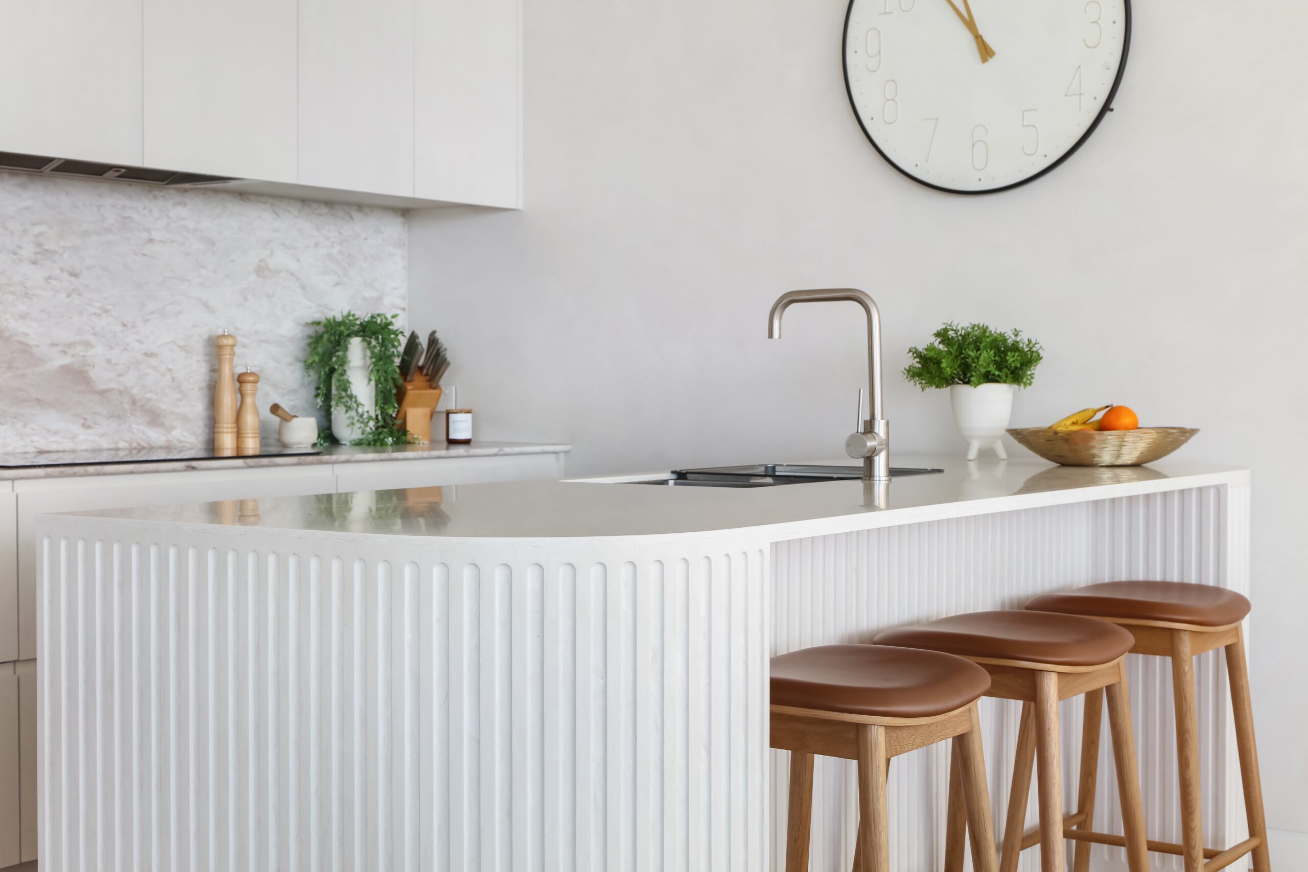
Witta
This residential kitchen was designed with the intention of creating a soft, cream-toned monochromatic colour scheme that had depth, using contrast in finishes to bring the space to life. Rather than introducing different colours, the focus was on subtle variation in form and texture to avoid the design feeling flat or one-dimensional. Central to the concept was a sculptural island bench that would serve as both a functional centrepiece and a statement within the room.
The 3-metre-long island was designed to appear as one continuous, seamless piece. Corian® was selected for its ability to achieve this effect through its inconspicuous joins and capacity for shaping. With only a 1-metre gap between a structural pillar and adjacent cabinetry, hidden support was required beneath the benchtop. Corian® allowed the design team to layer three 12 mm sheets around the perimeter to form a 50 mm bullnose edge, creating the illusion of a solid, monolithic form—something that would not have been possible with other materials.
The colour Bisque was chosen for its near-perfect match to the two-pack painted cabinetry, maintaining consistency across surfaces and aligning with the overall tone of the home. This attention to colour matching ensured a cohesive and refined result, allowing form and detail to provide visual interest within the neutral palette.
This kitchen showcases the design flexibility and refined finish that Corian® enables. The seamless bullnose edge became the defining feature of the space, demonstrating how Corian® can elevate a minimalist palette through thoughtful form and precision.
Other Projects

Salon Lane Bondi Junction
Salon Lane has established a location in Bondi Junction, bringing a premium co-working concept to the world of hair, beauty, and wellness. Designed as a hub for independent professionals, the space redefines what a salon environment can offer, combining private studios, open workstations, and high-end amenities in one contemporary setting. Spread across the ground and […]

The Garden Magpies Waitara
At Magpies Sports Club in Waitara, a major upgrade has transformed the venue into a sophisticated destination featuring The Garden Bar, a space that brings together contemporary design and natural elements. With a series of staggered outdoor terraces, the bar invites visitors to relax, dine, and socialise in an environment that balances modern form with […]

Nelson – Annadale
A beautiful family with plenty of personality wanted a home that not only reflected who they are but also made daily life easier. With their busy lifestyle, a complete overhaul of their home was undertaken to ensure every space worked hard for them, while still delivering comfort and elegance. The bathrooms, in particular, presented a […]

Douglas
This project transforms a traditional semi into a modern sanctuary for a young family, blending functionality with a refined sense of design. A striking feature of the renovation is the conceptual convex curved ceiling diagram, which introduces alternating ceiling heights to optimise natural light and airflow. This architectural approach defines the different living zones of […]

Bellevue Hill Kitchen
This apartment kitchen renovation by Dan Kitchens Australia was shaped by a brief that balanced function with creativity. The homeowners desired a practical layout with a subtle, timeless colour scheme, while giving the design team full freedom in form. As avid art lovers, they welcomed the idea of a kitchen that went beyond the purely […]

Meriton Suites Bondi Junction Lobby
The Bondi Junction Meriton Hotel, set between Sydney’s CBD and the iconic Bondi Beach, offers five-star accommodation with sweeping views of Sydney Harbour. The reconfigured lobby features a more open and welcoming reception area, improving guest flow and enhancing the overall check-in experience. Designed to reflect a refined, modern aesthetic, the space balances visual impact […]

1 ADELAIDE TCE COFFEE KIOSK
The 1 Adelaide Tce – Coffee Kiosk is a sculptural café installation designed as a visual and social centrepiece within a revitalised commercial atrium in Perth’s CBD. Curved, open, and inviting from every angle, the kiosk offers a striking contrast to the surrounding rigid architecture of the office building, encouraging engagement and connection within the […]
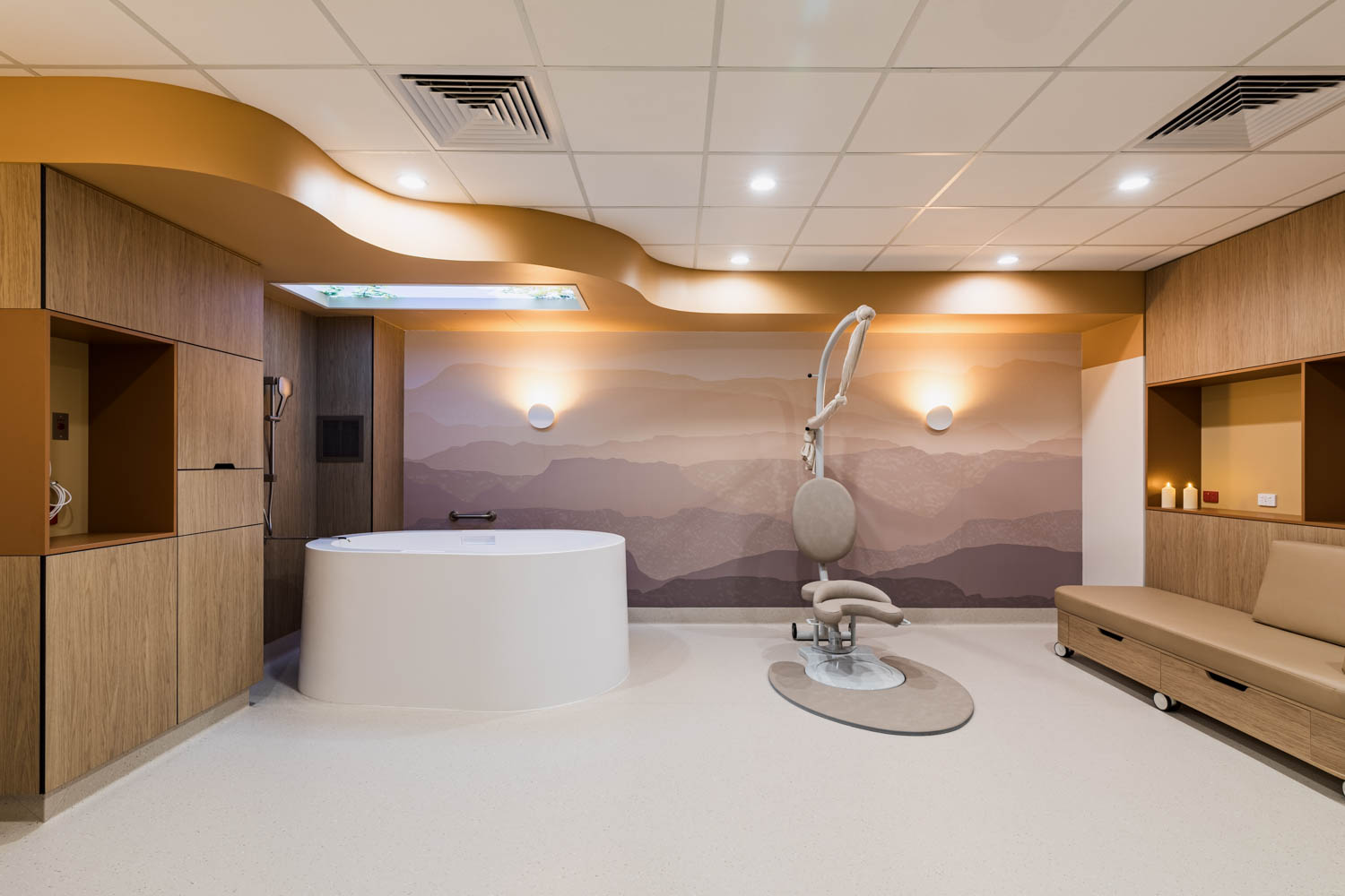
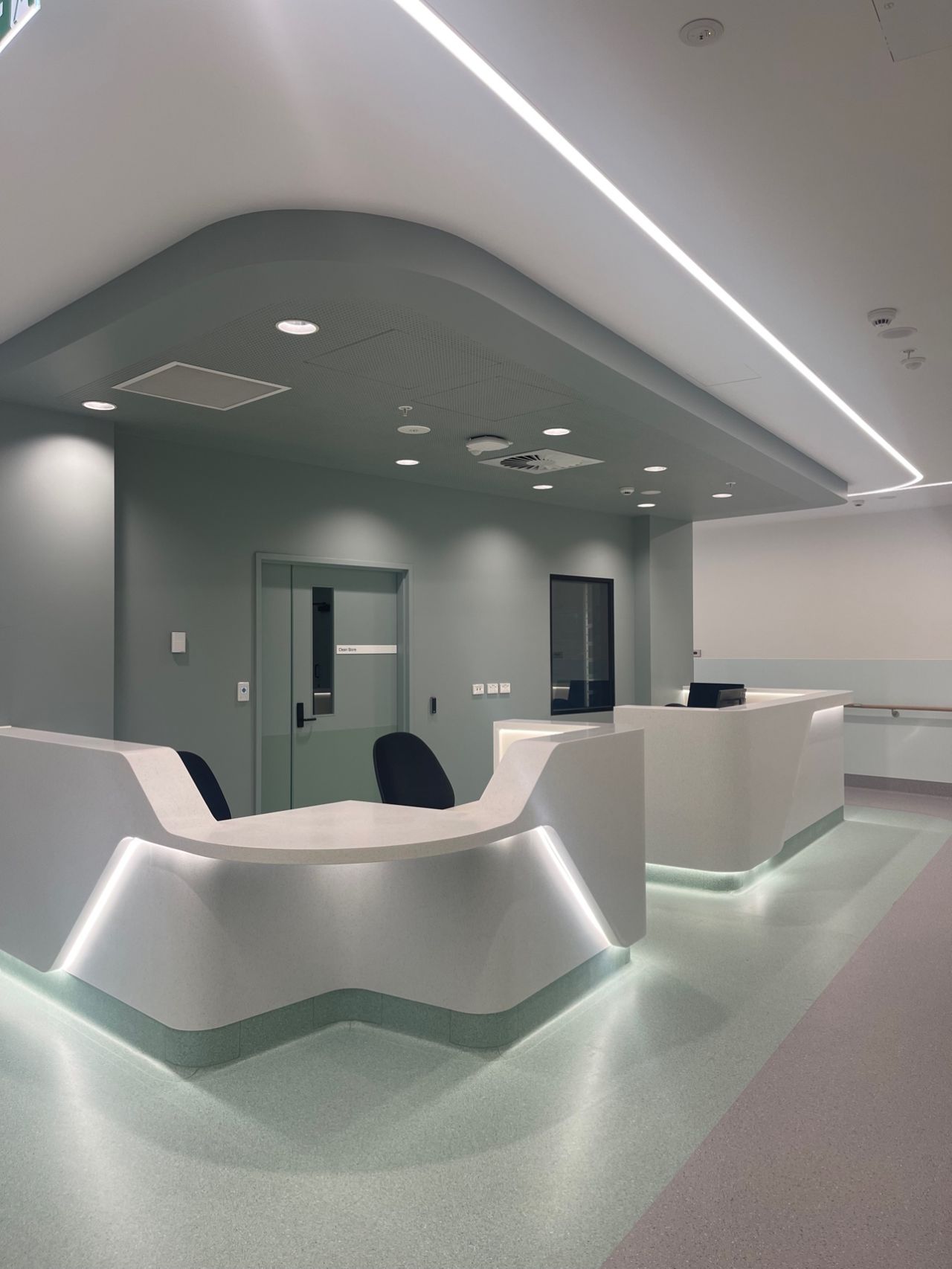
Bentley Hospital: Birthing Pool
Corian® Birthing Pools at Bentley Hospital: Supporting Safe, Comfortable Birth Experiences Bentley Hospital in Western Australia has unveiled its new Midwifery Birth Centre — a landmark development in maternity care within WA’s public health system. This purpose-built centre is the first of its kind in the state to offer a fully midwife-led model of care […]

Cosmos Prima Kitchen
This thoughtfully designed kitchen showcases the perfect fusion of form and function, with a standout island at its heart. Crafted to meet the needs of contemporary living, the kitchen combines bold aesthetics with clever utility, creating a space that is as practical as it is beautiful. The project features Corian® Solid Surface in the rich […]

Yangarra Estate
The Yangarra Estate is a luxurious, state-of-the-art cellar door designed to immerse visitors in the winemaking journey, from vineyard to bottle. JBG Architects + Interiors envisioned a sophisticated space that reflects Yangarra’s ethos—attention to detail, purity of expression, and an authentic connection to place. Every element of the design was meticulously curated to enhance the […]

Bahama Beach House
The vision for this project was to incorporate arched louvered windows to protect the client’s outdoor area from inclement weather. These windows needed to be robust, easy to clean, and maintenance-free while maintaining a seamless and aesthetically pleasing design. Traditional timber joinery was initially considered, but the complexity of the arched shape presented challenges due […]

Jets Club Ipswich
The Jets Club in Ipswich CBD worked with Paynters design team to revitalise an underused space in their clubhouse. The project involved demolishing an outdated service bar and opening up walls to let in more natural light. Artificial lighting was carefully designed to enhance the space, with a glowing bar and an oversized artificial skylight […]

Chifley Tree Table
8 Chifley is a striking architectural landmark in Sydney’s CBD, originally designed by Rogers Stirk Harbour + Partners. The latest phase of the project enhances the public plaza, creating a more inviting and functional space for people to gather, relax, and enjoy the city’s dynamic atmosphere. With an emphasis on pedestrian accessibility, the revitalised plaza […]

Glenelg Marina
This prestigious Glenelg apartment kitchen renovation takes centre stage with breathtaking views over the marina and Colley Reserve. Positioned centrally within the home, the kitchen was designed to maximise both easterly and westerly outlooks. A refined galley-style layout with discreet lines ensures the space remains understated, allowing the scenery to be the star. By night, […]

Fluted Vanity
This ensuite renovation reimagines the space for a more open, luxurious feel. The original ensuite and walk-in wardrobe were combined into one spacious area, while the wardrobe was relocated to an adjacent wall in the master bedroom. Corian® was used in various applications, including a vertically curved and fluted vanity, horizontal surfaces, and custom oval […]

Ambience Wellness
Ambience Wellness is a tranquil massage sanctuary nestled within a bustling mall, meticulously designed to offer an escape from the outside world. The space is inspired by the principles of earth, fire, and water, creating an environment that fosters self-connection, balance, and healing. Sculpted elements resembling natural stone contribute to the soothing atmosphere, making visitors […]
Monaco Kitchen
A Family-Centric Kitchen with Corian® and Axix™ Sink Designed to be both stylish and practical for a family of five, this kitchen project seamlessly integrates aesthetics with functionality. A key design requirement was a large island where children could be seated while their parents worked in the kitchen. The end of the bench was envisioned […]

W Sydney Double-sided Washplanes
Double-Sided Corian® Solid Surface Washplanes Inside the W Sydney, a popular hotel in the heart of Darling Harbour, double-sided washplanes made of Corian® Solid Surface are redefining the guest bathroom experience. Designed for both functionality and aesthetic appeal, these washplanes offer safety, convenience, and a modern, luxurious look. Curved Corners for Safety The smooth, curved […]

Estia Health, St Ives
Located in Sydney’s northern suburbs, Estia Health, St Ives, provides premium aged care with a focus on comfort, safety, and innovation. Supporting 118 residents, including 18 memory care places, the facility offers tailored care services such as short-term respite, long-term residential care, reablement, and dementia care. A Tailored Living Experience Residents at Estia Health, St […]
Calacatta Greige Kitchen
At the heart of this kitchen design is a Corian® Calacatta Greige benchtop and splashback combination. The benchtop stretches across the kitchen with a clean, smooth finish that highlights the beauty of its creamy base and delicate veining. This continuous surface flows effortlessly up the wall to form the splashback, creating a sleek, cohesive look. […]
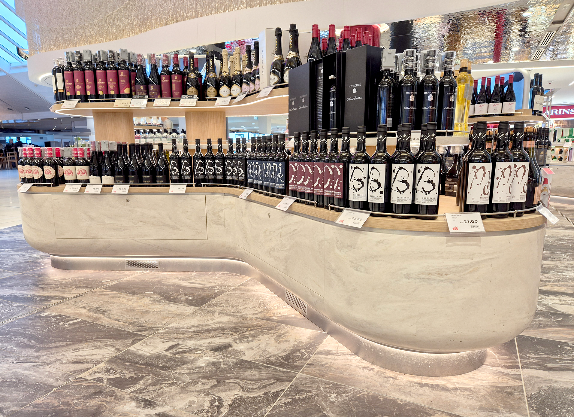
T2 Heinemann Project
Heinemann Oceania transformed their retail space within Sydney Airport’s T2 and T3 domestic terminals, introducing a department store experience for domestic travellers—a first for Australian travel retail. This project aimed to blend high-end shopping with the bustling airport environment, creating an elegant and functional space for travellers. For Terminal 2, the design was inspired by […]
Alfred Lane House Infectious Diseases
The Alfred Lane House Infectious Diseases Project at the Alfred Hospital has transformed a once under-utilised 1960s brick building into a modern, inclusive space that is designed to facilitate the recovery and rehabilitation of HIV-positive patients. This newly developed space supports an innovative model of care that allows patients with compromised immune systems, who often […]
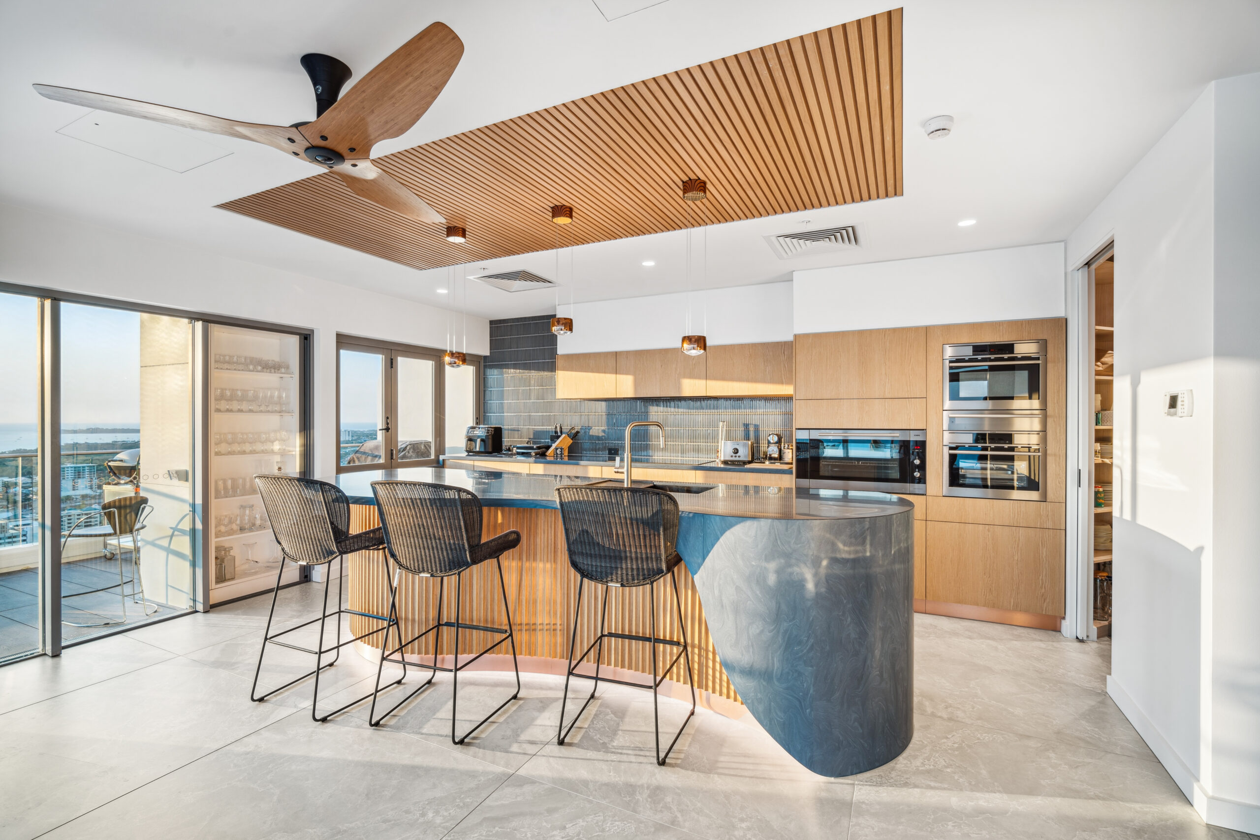
Mantra Apartments Darwin NT
The refit of the penthouse apartment on Level 28 of Mantra Pandanas in Darwin, NT, presented an exciting opportunity to elevate an already luxurious space to new heights. The project encompassed a complete overhaul of the living zone, including new flooring, ceiling finishes, joinery, lighting, fans, and wall treatments. The goal was to transform this […]
Audrey Residence
The design of the Audrey Residence masterfully balances the principles of architecture with the beauty of nature. Situated on a sand dune overlooking Bate Bay, Audrey Residence is a stunning addition to Cronulla’s iconic oceanfront. It offers luxurious, relaxed living and sets a new benchmark in high-end beachside residences with generous floor plans and exquisite […]

Motor Yacht More
Boat Style embarked on a comprehensive interior and exterior refit of a 44-metre Benetti Vision superyacht. Central to the redesign was a transformation of the Main Saloon, where a large entertainment cabinet and timber dining table were removed to create a more open and functional space. In their place, a ceiling lift widescreen television and […]
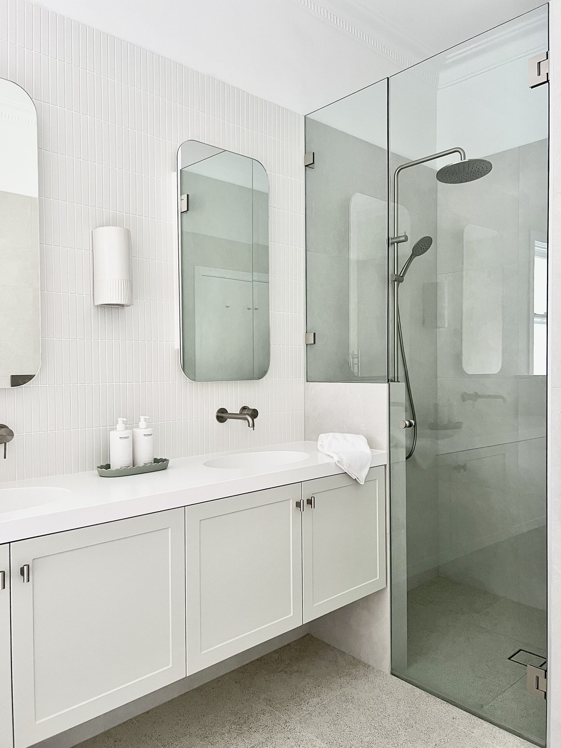
Willoughby Bathroom
Tranquil Bathroom Renovation: A Serene Escape This Willoughby home recently underwent a stunning transformation in both the main bathroom and ensuite, creating tranquil retreats perfect for relaxation and rejuvenation. The design features soothing shades of grey, blending seamlessly with neutral tones to evoke a peaceful and calming atmosphere. One bathroom features a minimalist single basin, […]